What are heatmap AI summaries?
Heatmap AI summaries take the visual data in your heatmap — where shoppers clicked, what they ignored, where they got stuck — and turn it into a written rundown plus a list of concrete suggestions. You get observations, issues and opportunities, and prioritised recommendations without having to interpret the heatmap yourself.
What’s in a heatmap AI summary
Section titled “What’s in a heatmap AI summary”Each summary has three sections:
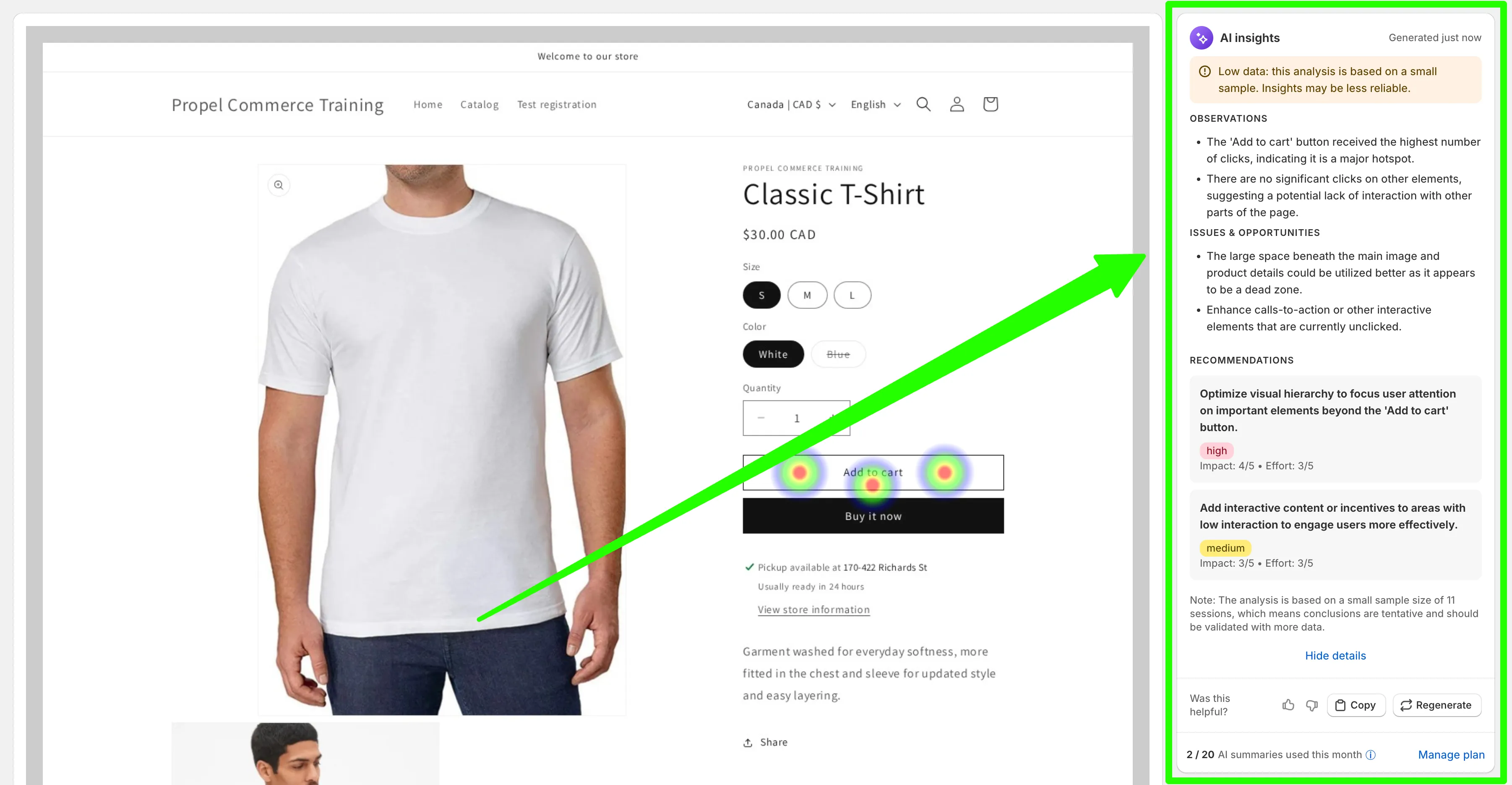
- Observations — what the heatmap is showing. (“The ‘Add to cart’ button received the highest number of clicks, indicating it is a major hotspot.”)
- Issues & opportunities — what’s not working, or what’s underused. (“The large space beneath the main image and product details could be utilized better as it appears to be a dead zone.”)
- Recommendations — concrete suggestions you can act on, each tagged with an impact rating (high/medium/low) and an effort estimate so you can prioritise.
It also flags when the analysis is based on a small sample size, so you know when the insights are tentative versus reliable.
When it’s useful
Section titled “When it’s useful”- Reading new heatmaps fast. Glance at the summary first, then dive into the heatmap detail only for the parts that matter.
- Deciding what to change. The recommendations give you a starting point instead of staring at coloured dots and guessing.
- Sharing insights with your team. Copy the recommendations into a ticket or design brief and skip writing them up yourself.
AI summary quota
Section titled “AI summary quota”Each shop gets a monthly AI summary quota that’s shared between heatmap summaries and replay summaries. Your current usage is shown below each summary (e.g. “2 of 20 AI summaries used this month”). The quota replenishes at the start of each month.
If you regularly use up your quota and want more, upgrading your plan gives you a larger monthly allowance.